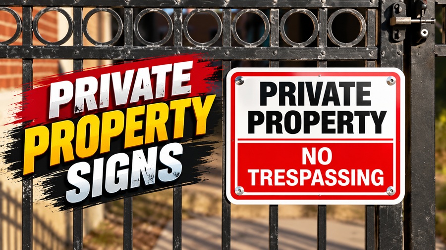


A visitor approaching your property shouldn’t have to guess where to park, whether a road is private, or which entrance to use. Well-planned signage answers those questions before confusion turns into a problem.
Private property signs can communicate access rules, identify restricted areas, and guide guests, contractors, and delivery drivers. But a sign only helps if people can see it, understand it, and act on it in time.
The goal isn’t to cover every fence with warnings. It’s to place clear, useful messages where they matter—and understand what signage can and cannot accomplish.
Start with the Purpose of Each Sign
Before choosing a design, decide what you need people to know or do.
“Private Property” identifies the nature of a site, but it may not explain whether guests can enter, deliveries are welcome, or parking is restricted. More specific wording often prevents misunderstandings.
Common purposes include:
| Purpose | Example wording |
| Restrict general access | Private Property — Authorized Access Only |
| Direct visitors | Visitors: Please Check In at Reception |
| Manage parking | Reserved Parking — Permit Holders Only |
| Guide deliveries | Deliveries: Use Service Entrance |
| Identify a private road | Private Road — No Through Access |
| Separate work areas | Staff Only Beyond This Point |
These are communication examples, not legally compliant templates for every location. Rules involving trespass, towing, fire access, or workplace hazards may require prescribed wording and formats.
Keep the Message Short and Specific
People rarely stop to read a long paragraph on a gate. Drivers have even less time to process detailed instructions.
Put the main message first, followed by the action people should take. For example, “Authorized Vehicles Only” is clearer when paired with “Visitor Parking to the Left,” if that direction is accurate.
Avoid combining unrelated instructions on one sign. Parking rules, delivery directions, and hazard warnings serve different purposes and may belong in different places.
Keep the tone firm but practical. Threatening language can create tension without improving clarity.
If you include a phone number or contact method, make sure it is monitored and easy to use. A sign directing someone to call an unanswered number leaves the original problem unresolved.
For mixed-language audiences, consider concise translations and familiar symbols. Avoid shrinking essential text to squeeze too much onto one panel.
Design for Real Viewing Conditions
A sign that looks readable on a computer screen may be difficult to understand from a driveway.
Letter size, contrast, font, viewing distance, and vehicle speed all affect readability. Simple typefaces and clear spacing generally work better than decorative lettering.
Choose strong contrast between the text and background. Don’t rely on color alone to communicate meaning, particularly where readers may have limited color vision.
Test the design from the actual approach distance. Consider whether someone can read it while walking, approaching slowly in a vehicle, or waiting at a gate.
Nighttime visibility may require reflective material or suitable illumination. Reflectivity works only when light reaches the sign at a useful angle, so check it under real conditions rather than assuming it will be visible.
Place Signs Before the Decision Point
Useful signage gives people time to choose the correct route.
A parking restriction hidden behind parked vehicles is easy to miss. A delivery instruction placed beyond a locked gate arrives too late.
Walk through the property as if you were visiting for the first time. Check:
- Main and secondary entrances.
- Driveway approaches.
- Pedestrian access points.
- Parking entrances and individual spaces.
- Service roads and loading areas.
- Doors leading to restricted sections.
Large sites may need repeat signs at separate access points. However, unnecessary repetition can create clutter and make important messages less noticeable.
Mount signs securely without blocking sightlines, accessible routes, emergency exits, or safety equipment. Where placement affects public roads, sidewalks, or rights-of-way, confirm permission and applicable requirements before installation.
Choose Materials That Match the Location
Outdoor signs need to withstand the conditions they will actually face.
Aluminum and other rigid materials are often used for longer-term installations. Some plastics work well too, depending on thickness, UV resistance, and exposure. Lightweight temporary panels may suit short projects but can deteriorate or become unstable in wind.
Consider:
- Sun exposure and fading.
- Rain, snow, salt, and humidity.
- Wind loading and mounting strength.
- Vandalism or accidental impact.
- How easily the panel can be replaced.
The printed finish matters as much as the base material. Check expected outdoor durability rather than assuming every metal sign is weatherproof.
Inspect posts, brackets, and fasteners too. A durable panel attached to failing hardware is still a maintenance problem.
Understand the Legal Limits
A sign communicates instructions; it does not automatically establish ownership, prove a boundary, or create an enforceable restriction.
Local rules may govern sign size, placement, lighting, wording, permits, and spacing. Trespass notices and towing signs can have specific requirements that a generic online product does not meet.
Existing easements, access rights, and other legal obligations may also affect what you can restrict. Posting “Private Property” does not remove those rights.
Where traffic-control signs are involved, verify which standards apply. In the United States, requirements may extend to certain privately owned roads open to public travel, but they do not apply identically to every private site.
For disputed boundaries, enforcement concerns, or significant liability questions, seek jurisdiction-specific advice rather than relying on the sign seller.
Make Signage Part of the Access Plan
Signs work best when the property’s layout supports the message.
If a gate says “Visitors Use Main Entrance,” that entrance should be identifiable and accessible during the stated hours. If parking requires a permit, visitors need a clear way to obtain one or find an alternative space.
Depending on the site, signage may work alongside gates, fencing, lighting, intercoms, or staff procedures.
Avoid making claims that aren’t accurate. A notice stating that cameras operate continuously should reflect the actual system and comply with relevant privacy requirements.
Safety warnings also do not replace fixing hazards. A sign is not an adequate substitute for repairing a dangerous walkway or securing an unsafe area.
Inspect Signs as Conditions Change
Signs can become ineffective gradually. Vegetation grows, lettering fades, parked vehicles block views, and old instructions remain after site arrangements change.
Assign someone to check signs periodically and after storms, construction, or access changes.
Look for dirt, damage, loose hardware, obscured views, and outdated information. Check important entrances both during daylight and after dark when appropriate.
Remove obsolete signs rather than adding new instructions beside them. Conflicting messages create uncertainty and make the property harder to navigate.
For larger sites, keep a simple inventory showing each sign’s location, purpose, condition, and replacement needs.
A Practical Planning Checklist
Before ordering or replacing signs:
- Identify the specific rule or direction.
- Decide who needs the information.
- Confirm any legal or site requirements.
- Choose concise wording and a readable design.
- Test the proposed location from normal approaches.
- Select suitable materials and secure mounting.
- Assign responsibility for maintenance.
This process helps avoid buying signs that look appropriate but fail to solve the actual access problem.
Final Thoughts
Effective property signage makes expectations clear without overwhelming visitors. Focus on specific messages, useful placement, readable design, and regular upkeep.
Treat private property signs as one part of managing access not as a substitute for accurate boundaries, safe conditions, or appropriate legal procedures.